
Iron Horse Acquisition II Corp. (IRHO) Stock Analysis
Iron Horse Acquisition II Corp.
▾ What's in the 27/100 risk score? (higher = riskier)
Contributions (weight × component score) sum to the total. This near-term score now includes fundamental health (leverage, FCF trend). See the Financial Health section for the full balance-sheet read.
How to read IRHO (pre-profit growth)
This company is reinvesting instead of generating profit, so a standard DCF cannot price it. The useful question is whether the growth the market is paying for is achievable — and whether the company can fund itself until then.
-
1
Reverse-DCF — the growth the price demands ↓
It shows exactly how fast the business must grow to justify today's price. Compare that to what comparable companies have actually achieved.
-
2
Cash runway ↓
Can it reach profitability before it has to raise money and dilute shareholders?
-
3
Interactive calculator ↓
Set your own growth + margin assumptions and see what the business would be worth if you are right.
IRHO's SEC filings give us limited machine-readable financials — common for some foreign or newly-listed filers that report under IFRS or file abbreviated statements. We can't run a full valuation on a partial dataset.
What to use instead: What we have parsed is shown below. As more complete filings arrive (or IFRS support lands), the valuation will populate.
Riskier than 68% of the stocks we cover
A model trained on every US filing since 2012 — including the 823 companies that went bankrupt or stopped trading under a dollar — ranks each covered stock by its chance of failing in the next year. This is a position among peers, not a prediction about this company alone. Below is what happened to stocks that sat in the same position in past years.
▾ Every band, and what happened to the stocks in it
| Rank band | went bankrupt within 12 months | fell 80% or more (or failed) within 12 months | fell 50% or more (or failed) within 6 months |
|---|---|---|---|
| All covered stocks (average) | 0.59% | 4.21% | 8.51% |
| Finance (sector average) | 0.13% | 1.25% | 3.09% |
| riskiest 1% | 16.4% of 1,749 | 33.0% of 1,998 | 45.5% of 2,239 |
| next 2% (97-99) | 5.9% of 3,360 | 24.9% of 3,985 | 38.2% of 4,461 |
| next 2% (95-97) | 3.4% of 3,409 | 21.2% of 3,984 | 33.8% of 4,462 |
| next 5% (90-95) | 1.6% of 8,443 | 15.1% of 9,965 | 27.3% of 11,155 |
| next 15% (75-90) | 0.8% of 25,328 | 8.5% of 29,884 | 17.8% of 33,459 |
| next 25% (50-75) ← this stock | 0.2% of 36,310 | 2.7% of 49,810 | 6.2% of 55,771 |
| safest half | <0.1% of 92,256 | 0.5% of 99,617 | 2.1% of 111,538 |
Counts are stock-quarters 2012–2025, scored each year by a model that had not seen that year. The rank is recomputed from each company's latest filing (this one: 2026-04-03); table generated 2026-09-17. Calibrated one-year odds for this stock alone: bankruptcy 0.2%, 80%+ fall 0.5%, 50%+ fall in six months 1.8% — treat these as rougher than the band counts; the model overstates the middle of the range.
What this is not. It is not a trade. We tested shorting these names and buying puts on them at real option prices (2010–2025): every version lost money, because the market already prices the distress and the survivors squeeze. A high rank is a reason to read the filings and to size a position for the chance of a total loss — not a reason to bet against the company. A low rank says the balance sheet and the market are calm; it says nothing about whether the price is sensible.
How does IRHO stack up against its closest peers?
We take the 8 same-industry companies most similar to IRHO (similar size) and check what investors are paying for each dollar of their revenue (or profits). If IRHO is much more expensive on the same yardstick, that's a red flag — unless you have a specific reason it deserves a premium.
▾ What's "EV / Sales" in plain English?
EV (Enterprise Value) = market cap + total debt − cash. It's "what you'd pay to buy the entire company outright" — you pay the market cap to shareholders and take over their debt, but you keep their cash. EV is fairer than market cap alone because it includes the debt the new owner inherits.
EV / Sales = EV ÷ annual revenue. So "2.5×" means investors pay $2.50 of enterprise value per $1 of yearly sales. Higher = market is paying more per dollar of sales (usually because they expect future growth or fat margins).
p25 / median / p75 are the 25th, 50th (middle), and 75th percentile of the peers' multiples. Half the peers fall between p25 and p75. The median (p50) is the typical peer — that's the benchmark we compare to.
Bold middle number = median peer. Half the peers trade above it, half below. Computed over 8 same-industry peers; implausible multiples excluded.
⚠️ Important caveat: peer multiples only work if the peers are genuinely comparable. Always check the peer list below — if the auto-picker grabbed micro-caps or unrelated businesses, the comparison is noise. A medical-device giant priced against tiny biotech startups won't produce a useful signal.
▾ View peer list (8)
| Ticker | Company | Industry | Mcap | EV/Sales | EV/GP | EV/EBIT | FCF Yield |
|---|---|---|---|---|---|---|---|
| YHNA | YHN Acquisition I Ltd | SPACs | $47M | — | — | — | — |
| UYSC | UY Scuti Acquisition Corp. | SPACs | $56M | — | — | — | — |
| SSEA | STARRY SEA ACQUISITION CORP | SPACs | $78M | — | — | — | — |
| WSTN | Westin Acquisition Corp | SPACs | $82M | — | — | — | — |
| YCY | AA Mission Acquisition Corp. II | SPACs | $121M | — | — | — | — |
| VECA | Vernal Capital Acquisition Corp. | SPACs | $131M | — | — | — | — |
| XFLH | XFLH Capital Corp | SPACs | $138M | — | — | — | — |
| TRAD | APEX Tech Acquisition Inc. | SPACs | $142M | — | — | — | — |
Quality & solvency checks
Cheap stocks can be cheap for a reason. These screens warn when a low valuation comes paired with structural fragility.
Why it matters: Cheap-looking stocks (low P/E or P/B) often have low Z-scores because the market knows the company is dying. Z-score warns you before you fall into a value trap.
Reference: > 3.0 = safe zone · 1.81–3.0 = grey zone · < 1.81 = distress zone
Full explanation →
The Z-score needs working capital, retained earnings, EBIT, sales and total assets from the latest balance sheet, and at least one of those isn't reported in machine-readable form here — common for foreign private issuers. We leave it blank rather than compute a distress verdict from an estimated input. It doesn't affect the reported figures in the financial tables below.
Why it matters: High score = fundamentals improving. Low score = deteriorating. Especially powerful for filtering cheap stocks: cheap + high F-score historically outperforms; cheap + low F-score is often a value trap.
Reference: 7–9 = strong · 4–6 = mediocre · 0–3 = weak
Full explanation →
The F-score compares two consecutive years of income, cash-flow and balance-sheet data. This filer has only 1 usable year, so there is no prior period to compare against. We show nothing rather than score a partial year against itself. The reported figures in the financial tables below are unaffected.
Plain English: the company holds about $0M in cash and is burning roughly $0M/year in operations. At that pace, the cash lasts 0 mo before it must raise capital (diluting shareholders), take on debt, or cut spending.
Assumes constant burn and ignores financing/asset sales. For pre-profit biotech and growth companies, this matters more than a DCF — a great drug pipeline is worthless if they run out of money before approval.
Analysis narrative not yet available for this stock.
As of 3 months ago
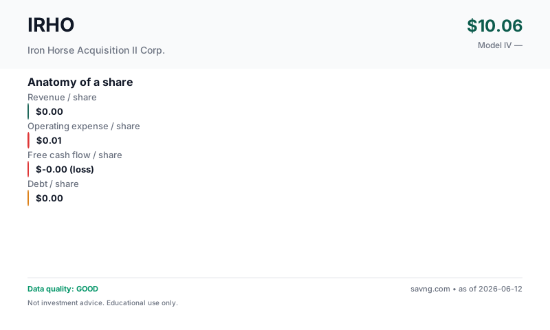
Anatomy of a share
What you're buying per share. Bars are at the same scale so you can see the relative size of revenue, costs, cash flow, and debt — not just read them in a table.
What's free cash flow / what do these mean?
Revenue per share — how much the business earns from customers, divided by the number of shares outstanding. Top of the income statement.
Earnings per share — profit left after operating costs, interest, and taxes, per share. Two versions appear on this page and are not interchangeable: GAAP diluted EPS uses the company's weighted-average diluted share count during the reporting period (this is the "earnings" in "price-to-earnings"); net income per current share divides annual net income by today's share count. They differ whenever the share count has changed.
Owner-earnings free cash flow per share — the cash the business produces for shareholders. Savng's owner-earnings FCF subtracts capital expenditures and stock-based compensation from operating cash flow (SBC is a real dilution cost even though it's non-cash). This is deliberately more conservative than "standard" FCF, which subtracts only capital expenditures — so our figure is lower than the headline FCF you'll see elsewhere. FCF funds dividends, buybacks, debt repayment, and acquisitions; a company can report positive earnings yet negative FCF.
Debt per share — total interest-bearing borrowings divided by shares. High debt-per-share next to thin FCF-per-share is a fragility signal.
Management & Leadership
What They Make
Company description not yet available.
Why Is It Priced Like This?
What we use instead: earnings (P/E, EV/EBIT), book value (P/B) — computed from the figures this company does report, shown in the sections below. Those numbers are unaffected by the missing cash-flow data.
Business Model & Valuation
Growth / Revenue DCF
Negative free cash flow: revenue/margin growth model used - standard FCF DCF is unreliable for companies still scaling.
Show advanced inputs
| Revenue Growth | 15.0% |
What this model does NOT do: this is a consolidated owner-earnings FCF model. Standalone segment assumptions: none. It does not project net interest income and fee-income lines independently; their combined effect is embedded in the historical revenue and cash-flow trend the model extrapolates. The calculator above can only approximate a segment's impact through the single consolidated growth rate — it cannot model any one line separately. For a true segment-level view, build a separate model from the company's segment disclosures.
Maturity & Competitive Position
Geography & Markets
Market Signals
These are timing signals, not value signals — they describe the stock's recent price behavior, not what the business is worth. Use them for the "the thesis looks good, but is now the moment?" question. Each tile below explains what it's saying.
Why it matters: Short-term contrarian indicator. Extreme readings often precede mean reversion, though not always.
Reference: 30–70 normal · >70 overbought · <30 oversold
Full explanation → (14)68.1NeutralMomentum is balanced — neither overbought nor oversold.
Why it matters: When the fast line crosses above the slow line, short-term momentum is turning up; below, turning down. A timing cue, not a value signal.
Reference: Line above signal = bullish momentum · below = bearish
Full explanation →BullishLine above signalThe fast trend is above the slow trend — short-term momentum is currently upward.
Technicals describe price, not the business. A great company can have a "bearish" tape (a buying chance) and a weak one a "bullish" tape (a trap). Pair these with the valuation and health sections above.
QUALITY
Data Quality & Risk Flags (4 notes — click to expand/collapse)
Guardrail Notes (4)
- FCF negative: revenue/margin growth model projects future cash flows from revenue trajectory.
- INVARIANT: weighted IV is non-positive. Model may not be appropriate.
- Model implies no positive equity value under these assumptions. Valuation is speculative/low-confidence.
- Illiquidity discount 15% applied (small/micro-cap — harder to exit, demand a margin).
FINANCIALS
Financial Statements (5-year tables — click to expand)
From Iron Horse Acquisition II Corp.'s SEC filings (EDGAR).
Income (5yr)
| Year | Revenue | Net Income | EPS |
|---|---|---|---|
| 2025 | — | -204,391 | $-0.04 |
Cash Flow (5yr)
Capital expenditure isn't tagged in this filer's machine-readable data (the CapEx column shows "—"). The free-cash-flow column is therefore operating cash flow less stock-based compensation only — an upper bound on true owner earnings, not the real figure. Companies that report capex under a custom label (some large IFRS filers do) look better here than they are.
| Year | Operating CF | CapEx | − SBC & adj. | Free Cash Flow |
|---|---|---|---|---|
| 2025 | -142,761 | — | — | -142,761 |
How we define FCF: operating cash flow − capital expenditure − stock-based compensation (owner-earnings basis — SBC is a real cost to shareholders even though it's non-cash). This is the same owner-earnings FCF definition the valuation model uses, though the DCF's starting value is a projected from revenue × terminal margin, not this single year.
Balance Sheet
| Total Assets | 364,681 |
| Total Liabilities | 538,347 (derived) |
| Equity | -173,666 |