
Is American Vanguard Corp (AVD) a good stock to buy?
Two or more of our tested checks point the wrong way. When the survival check is one of them, no price makes that acceptable.
What each rating means, in numbers
Can it survive? — Very risky. Safer than 7% of the companies we cover, judged on the warning signs that came before companies that really did fail.
Business quality — Middling. Passes 5 of the 9 health checks we can measure — things like making a profit, turning it into cash, and not piling on debt. Across 131,000 company-quarters the weakest scorers went on to fail at 5.4% against 1.4% for the strongest, in every era and all twelve sectors.
How wild is the price? — Wild. The share price swings about 54% in a typical year, which puts it in the above average. Out of every 100 companies that swung like this, about 3.7 went bankrupt within the year. Across the three periods we tested that ran from 0.9% to 5.7%.
What "tested" means here, and why there is no score out of 100
Tested means the read was measured against what actually happened afterwards, on a history that keeps the companies that were later delisted, using only figures that had been filed on the day they are used. Survival was ranked on companies that really did fail. What an owner keeps was tested across the universe from 2011 to 2025.
The full record of everything we have tested is on the research pages.
Which benchmark. Over the period we tested, the median listed company returned +5.8% a year while the S&P 500 returned about +13.9% — the index is weighted by size and was carried by a handful of enormous winners. So "beats the index" and "beats the other companies you could have bought" are different questions. Where a read says it picks better companies, it means the second one. None of these gets you an index fund's return, and we would rather say that than imply otherwise.
The quality read is the strongest thing we have tested: 131,000 company-quarters across 5,300 companies, where the weakest scorers went on to fail at 5.4% against 1.4% for the strongest, holding in every era and all twelve sectors. It still says less likely to break, not likely to beat the market — every band in that study lost to the index at the median, because the median listed company does.
Each read is shown on its own rather than merged into a single score, so you can see which part is strong and which is weak instead of taking an average on trust.
▾ What goes into the smart-money reading
Contributions (weight × component score) sum to the total. This near-term score now includes fundamental health (leverage, FCF trend). See the Financial Health section for the full balance-sheet read.
Chance the S&P 500 falls 10% or more in the next three months.
Counted from every day since 2006. Says nothing about AVD — see the board for how it is measured.
📍 Where to start on this page, and what to look at first
How to read AVD (speculative micro-cap)
No model can pin a precise fair value on a company this small — but that does not mean there is nothing to learn. The useful questions are what the price is betting on, and whether the company can survive long enough to deliver it.
-
1
Reverse-DCF — what growth the price assumes ↓
The single most useful number here: it backs out the growth the market is paying for. If that figure is "historically unprecedented," the price is running on hype, not fundamentals.
-
2
Cash runway ↓
A pre-profit micro-cap lives or dies on whether it can fund itself to profitability before running out of money and diluting you.
-
3
The raw financial statements + the 10-K ↓
At this scale, the actual numbers, insider ownership, and share-count trend tell you more than any ratio.
Standard DCF doesn't fit AVD well — but that's expected for this kind of business. The EV/Sales Peer Comparison below uses the metrics actually used by analysts who value agricultural chemicals. Reverse DCF + Football Field also work as cross-checks.
Who owns AVD, and how it moves
From the SEC's own filings: every fund manager over $100M reports its holdings each quarter, and every officer and director reports theirs. Each point is what was public at the time.
105 institutions reported holding it at the latest quarter-end.
Riskier than 93% of the stocks we cover
What this rating means, and what it does not
What this rank is — Very risky. Riskier than 93% of the companies we cover. Out of every 100 companies ranked here, about 1.6% went bankrupt within the year, against 0.6% for the average company we cover. The rank comes from a model trained on every US filing since 2012, including 823 companies that really did fail, and scored each year by a version that had not seen that year.
What it is not — Not a trade. We tested shorting these names and buying puts, spreads, straddles and condors on them at real option prices, 2010-2025. Every version lost money: the market already prices the distress and the survivors squeeze. A high rank is a reason to read the filings and to size for a total loss, not a reason to bet against the company. A low rank says the balance sheet is calm, not that the price is sensible.
▾ The numbers, the logic, and why not to trade on it
The logic. A model trained on every US filing since 2012 — including 823 companies that went bankrupt or stopped trading under a dollar — ranks each covered stock by its chance of failing in the next year, from its latest filing, price history and credit conditions. The rank is a position among peers; the table is a count of what happened to stocks in each position, scored each year by a model that had not seen that year.
| Rank band | went bankrupt within 12 months | fell 80% or more (or failed) within 12 months | fell 50% or more (or failed) within 6 months |
|---|---|---|---|
| All covered stocks (average) | 0.59% | 4.21% | 8.51% |
| Chemicals (sector average) | 0.75% | 2.76% | 8.23% |
| riskiest 1% | 16.4% | 33.0% | 45.5% |
| next 2% (97-99) | 5.9% | 24.9% | 38.2% |
| next 2% (95-97) | 3.4% | 21.2% | 33.8% |
| next 5% (90-95) ← this stock | 1.6% | 15.1% | 27.3% |
| next 15% (75-90) | 0.8% | 8.5% | 17.8% |
| next 25% (50-75) | 0.2% | 2.7% | 6.2% |
| safest half | <0.1% | 0.5% | 2.1% |
Why not to trade on it. We tested shorting these names and buying puts, spreads, straddles and condors on them at real option prices, 2010–2025: every version lost money. The market already prices the distress, and the survivors squeeze. Use a high rank to read the filings and to size for a total loss — not to bet against the company. A low rank says the balance sheet is calm, not that the price is sensible.
Scored from the filing of 2026-05-07; table generated 2026-09-18. Within Chemicals: rank 96 of 100. Rough one-year odds for this stock alone: bankruptcy 1.5%, an 80% fall 10.3% (the model overstates the middle of the range). On the same data, the Altman Z score caught 26% of bankruptcies in its riskiest 5%; this rank caught 59%.
▾ The logic, and why not to buy on it
The logic. Trained on 2,900 acquisitions since 2012, the model leans on size (small), age, retained earnings, asset growth, volatility and how many deals the sector has just seen. Announcement = the day the stock jumped, not the day the paperwork was filed.
| top 1% | 15.4% acquired within a year |
| next 2% (97-99) | 10.3% acquired within a year |
| next 2% (95-97) | 9.0% acquired within a year |
| next 5% (90-95) | 7.3% acquired within a year |
| next 15% (75-90) ← this stock | 6.4% acquired within a year |
| next 25% (50-75) | 4.8% acquired within a year |
| bottom half | 3.0% acquired within a year |
Why not to buy on it. A takeover paid a median +22% on the day — but even in the top band about 6 in 7 companies are not bought, and those lag. Buying the whole top list returned what the S&P 500 did (2012–2023), and adding "cheap" or "beaten-down" filters did not change that. Read it as context for a thesis you already have, never as the thesis.
How to read a company this small
AVD is too small and/or too volatile for the valuation lenses we use on larger, more stable companies. The numbers shown below should be taken as rough orientation only.
- Market cap $45.5M — nano-cap territory (below $50M)
Growth percentages on tiny revenue bases (1000% going from $200K to $2M is not predictive). P/E and ROE swing wildly with small earnings changes. Peer comparisons fail because there often aren't comparable companies at this scale.
Start with the Reverse-DCF above — it backs out the growth the price is betting on; if that figure is "historically unprecedented," the price is running on hype, not fundamentals. Then the cash runway (can it fund itself to profitability before diluting you?). Then the raw Financials table and the 10-K on SEC EDGAR — at this scale, insider ownership and the share-count trend often matter more than any ratio.
Classified as Speculative Nano / Micro-cap (confidence 80%). Disagree? An admin can override via the post edit screen.
⚠ Genuine comparables are scarce at this size, so peer multiples are unreliable here. Treat as rough context only — see 📍 What to focus on above.
How does AVD stack up against its closest peers?
Ideally we compare AVD only to same-industry peers, but too few exist in our universe right now, so the basket below mixes in broader-sector names. Treat the multiples as rough context, not a valuation. For a leveraged business, FCF yield (in the table) is usually more reliable than EV/Sales, because revenue multiples ignore differences in margins and debt.
▾ What's "EV / Sales" in plain English?
EV (Enterprise Value) = market cap + total debt − cash. It's "what you'd pay to buy the entire company outright" — you pay the market cap to shareholders and take over their debt, but you keep their cash. EV is fairer than market cap alone because it includes the debt the new owner inherits.
EV / Sales = EV ÷ annual revenue. So "2.5×" means investors pay $2.50 of enterprise value per $1 of yearly sales. Higher = market is paying more per dollar of sales (usually because they expect future growth or fat margins).
p25 / median / p75 are the 25th, 50th (middle), and 75th percentile of the peers' multiples. Half the peers fall between p25 and p75. The median (p50) is the typical peer — that's the benchmark we compare to.
| EV / SalesEV / Sales — For every $1 of yearly revenue, this is how many dollars investors pay to own the whole business (including debt). Why it matters: Works for pre-profit growth companies where P/E and FCF don't apply. The most apples-to-apples cross-company multiple because it ignores accounting choices. Reference: 1–3x for mature companies · 4–10x for software/SaaS · 10–20x for hypergrowth · >20x is rare and demanding Full explanation → |
0.5x / 7.8x / 23.9x |
Bold middle number = median peer. Half the peers trade above it, half below. Computed over 8 peers (broad — see caveat); implausible multiples excluded.
⚠️ Important caveat: peer multiples only work if the peers are genuinely comparable. Always check the peer list below — if the auto-picker grabbed micro-caps or unrelated businesses, the comparison is noise. A medical-device giant priced against tiny biotech startups won't produce a useful signal.
▾ View peer list (8)
| Ticker | Company | Industry | Mcap | EV/Sales | EV/GP | EV/EBIT | FCF Yield |
|---|---|---|---|---|---|---|---|
| BIOX | Bioceres Crop Solutions Corp. | Agricultural Chemicals | $22M | 0.5x | 1.4x | — | 2.9% |
| CBUS | Cibus, Inc. | Agricultural Chemicals ·fallback | $86M | 23.9x | — | — | 0.6% |
| RYM | RYTHM, Inc. | Agricultural Services ·fallback | $54M | 7.8x | 13.2x | — | 0.0% |
| WWR | WESTWATER RESOURCES, INC. | Metal Mining ·fallback | $55M | — | — | — | 2.3% |
| VGAS | Verde Clean Fuels, Inc. | Industrial Organic Chemica ·fallback | $35M | — | — | — | 0.9% |
| XPL | SOLITARIO RESOURCES CORP. | Gold & Silver Mining ·fallback | $66M | — | — | — | 1.4% |
| SDST | Stardust Power Inc. | Nonferrous Metals ·fallback | $24M | — | — | — | 0.4% |
| USGO | U.S. GoldMining Inc. | Gold & Silver Mining ·fallback | $102M | — | — | — | 0.1% |
Bankruptcy + quality screens
Cheap stocks can be cheap for a reason. These screens warn when a low valuation comes paired with structural fragility.
What these health ratings mean, in numbers
Business quality — Middling. Passes 5 of the 9 health checks we can measure — making a profit, turning it into cash, not piling on debt, not issuing shares. Across 131,000 company-quarters the weakest scorers went on to fail at 5.4% within a year against 1.4% for the strongest, and that held in every era and all twelve sectors. It says "less likely to break", not "likely to beat the market".
Bankruptcy score (Altman Z) — Strained. Altman Z is 1.46. It combines working capital, retained earnings, operating profit and market value against total assets into one bankruptcy score. Above 3.0 is the safe zone, 1.8 to 3.0 is grey, below 1.8 is the distress zone. It was calibrated on manufacturers in 1968, so it reads asset-light and heavily-financed businesses badly — which is why it is one input here and never the verdict.
Why it matters: Cheap-looking stocks (low P/E or P/B) often have low Z-scores because the market knows the company is dying. Z-score warns you before you fall into a value trap.
Reference: > 3.0 = safe zone · 1.81–3.0 = grey zone · < 1.81 = distress zone
Full explanation →
Distress zone under the classic Altman thresholds — scores here have historically preceded a high rate of financial distress within ~2 years. This is a warning signal, not a direct bankruptcy probability, and its reliability varies by industry. Be very skeptical of any "cheap" valuation on this name.
The classic Z-score was calibrated on manufacturers. It is less reliable for asset-light or non-manufacturing businesses (broadcasters, media, software, services) and not applicable to banks, REITs, or insurers — for those the coefficients and the asset-turnover term distort the result. Read it as one screening input, not a verdict.
Why it matters: High score = fundamentals improving. Low score = deteriorating. Especially powerful for filtering cheap stocks: cheap + high F-score historically outperforms; cheap + low F-score is often a value trap.
Reference: 7–9 = strong · 4–6 = mediocre · 0–3 = weak
Full explanation →
▾ The checks — what passed, what didn't (and what we couldn't measure)
-
✗ Positive net incomeNet income -$49.9M in FY2025.Why this matters: Does the company actually earn a profit? Sustained losses eventually force it to raise money — diluting you — or take on debt.
-
✗ Positive operating cash flowOperating cash flow -$21.2M (was $3.9M the prior year).Why this matters: Profit can be an accounting figure; cash from running the business is harder to fake. Negative operating cash flow means the core business consumes cash and must be funded externally.
-
✓ Cash flow backs up reported profitOperating cash flow -$21.2M vs net income -$49.9M.
-
✓ Return on assets improvingReturn on assets -8.4% vs -19.8% a year ago.
-
✗ Debt load (vs assets)Long-term debt is 29.2% of assets vs 23.1% a year ago ($174.0M of $596.5M assets).Why this matters: Rising debt relative to assets means more risk and more cash going to interest instead of shareholders. Falling debt is a sign of strengthening.
-
✓ Short-term liquidity (current ratio)Current ratio 1.77x vs 1.63x a year ago.
-
✗ Share count (dilution)Share count rose 1.3% (28.1M → 28.4M year-over-year).Why this matters: Issuing lots of new shares splits the pie into more pieces, shrinking your slice. Stable or falling share count protects existing owners.
-
✓ Pricing power (gross margin)Gross margin 28.6% vs 22.0% a year ago.
-
✓ Sales per asset (asset turnover)Asset turnover 0.86x vs 0.86x a year ago.
Missing data is never counted as a pass or a fail — it's shown as n/a and excluded from the denominator. Each check compares the company against its own prior year.
What if you assume different inputs?
Here's where we land — and what happens if you change the assumptions. Drag the sliders to set your own Discount RateDiscount Rate — The annual return you demand for taking single-stock risk instead of buying a safe Treasury or index fund.
Why it matters: Higher discount rate = stricter valuation (a stock has to produce more cash to be worth holding). Lower = more generous.
Reference: 8–12% is standard · 9–10% matches S&P 500 historical return · Below 7% is illogical for single-stock risk
Full explanation → (the annual return you demand for single-stock risk) and terminal growth; the value updates live so you can see whether the stock looks cheaper or richer. The discount rate starts at 10.0%, the figure our model used for AVD. Open Advanced to also change beta, growth and the rate path.
Note: no headline intrinsic value is published for this stock (the valuation is held for a data-quality reason — see the notes above). The calculator below is a what-if tool: the values it produces are your assumptions played out, not our estimate.
A full intrinsic value isn't shown for AVD because the valuation is currently held for a data-quality reason (see the guardrail notes above). The reverse-DCF reading still works — it needs only the price and cash flow — but we won't publish a forward value until the underlying data passes our checks.
—
⚙ Advanced — tinker with every input (beta, growth, rate path, margin → full intrinsic value)
The market appears to be paying up for significant future growth, implying a 62.2% annual per-share cash flow growth, despite recent revenue DECLINING (-2%/yr over 4yr) and operating cash flow being NEGATIVE latest. The biggest risk that our model's base assumptions prove too high is that operating cash flow continues to be negative, rather than stabilizing or growing at the modeled +2.9% rate.
As of 7 days ago
Anatomy of a share
What you're buying per share. Bars are at the same scale so you can see the relative size of revenue, costs, cash flow, and debt — not just read them in a table.
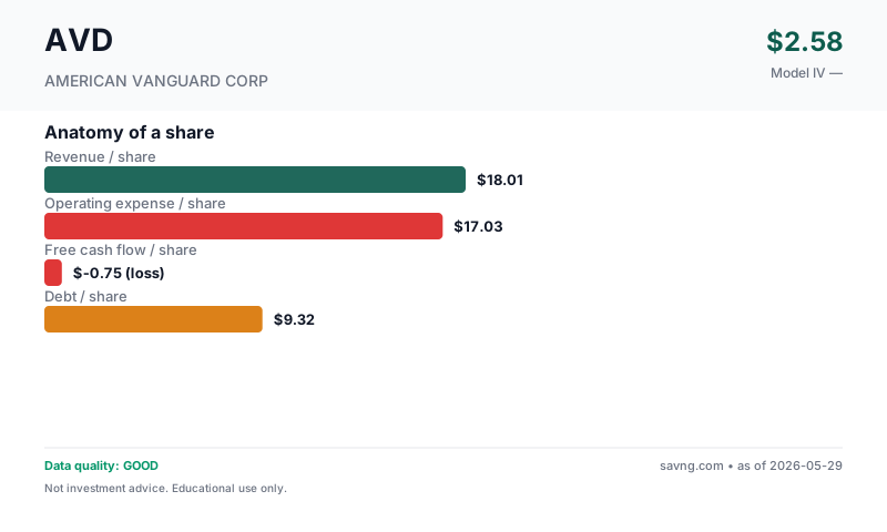
What's free cash flow / what do these mean?
Revenue per share — how much the business earns from customers, divided by the number of shares outstanding. Top of the income statement.
Earnings per share — profit left after operating costs, interest, and taxes, per share. Two versions appear on this page and are not interchangeable: GAAP diluted EPS uses the company's weighted-average diluted share count during the reporting period (this is the "earnings" in "price-to-earnings"); net income per current share divides annual net income by today's share count. They differ whenever the share count has changed.
Owner-earnings free cash flow per share — the cash the business produces for shareholders. Savng's owner-earnings FCF subtracts capital expenditures and stock-based compensation from operating cash flow (SBC is a real dilution cost even though it's non-cash). This is deliberately more conservative than "standard" FCF, which subtracts only capital expenditures — so our figure is lower than the headline FCF you'll see elsewhere. FCF funds dividends, buybacks, debt repayment, and acquisitions; a company can report positive earnings yet negative FCF.
Debt per share — total interest-bearing borrowings divided by shares. High debt-per-share next to thin FCF-per-share is a fragility signal.
What you actually need to decide
Every stock price is a disagreement. Here's the single thing that must go right for the bulls, the single thing that breaks the thesis, and the concrete signposts to watch so you can update your view as real results arrive.
- Next quarter's revenue growth rate
- Operating cash flow returning to positive territory
- Trends in gross margin (currently COMPRESSING)
The trend, in plain numbers (FY2024 → FY2025, latest reported)
Straight from the financial statements — no model, no opinion. For a small or unprofitable company, the direction of these numbers usually tells you more than any single valuation.
- Gross margin improved to 29% (+7 pts).
- Still unprofitable at -$49.9M — loss narrowing.
- Revenue fell -6% to $515.1M.
- Free cash flow is negative at -$27.1M — the cash burn widened vs last year.
Management & Leadership
Douglas Kaye serves as the Chief Executive Officer, with David T. Johnson as the Chief Financial Officer. Other key executives include Michael Joseph Dipaola, Chief Commercial Officer, and Shirin Khosravi, CHRO. These individuals lead the company's strategic and operational functions.
CHIEF EXECUTIVE OFFICER
Chief Financial Officer
What They Make
American Vanguard Corp develops and markets a diverse portfolio of agricultural chemicals, including insecticides, fungicides, herbicides, and plant growth regulators. Their products are primarily sold to growers and distributors in the agricultural sector.
End Markets
Revenue Drivers
Why Is It Priced Like This?
Why Customers Pay
What we use instead: earnings (P/E, EV/EBIT), book value (P/B) — computed from the figures this company does report, shown in the sections below. Those numbers are unaffected by the missing cash-flow data.
The market prices AVD at a premium of +1947.1%, implying a significant 62.2% annual per-share cash flow growth, which is substantially higher than the model's +2.9% growth assumption. This optimism may be driven by the market assigning value to potential new product introductions or market share gains in specific agricultural chemical segments, which are not in the model. However, this optimism contrasts with the latest fiscal year's NEGATIVE net income and operating cash flow, and long-term debt RISING to $174.0 million.
Business Model & Valuation
How They Make Money
The company's latest fiscal year saw negative free cash flowFree Cash Flow (FCF) — Operating cash flow minus capital spending: cash left after a company covers operating costs, taxes and interest and reinvests in the business — but BEFORE repaying debt principal or paying dividends. The cash actually available to investors.
Why it matters: A company can show big profits on paper while burning through cash. FCF is what actually fills the bank account.
Reference: Healthy mature businesses convert 8–15% of revenue into FCF · Growth companies often negative
Full explanation → after stock comp of -$27.1 million, indicating it is funding operations through other means, potentially debt, which has risen to $174.0 million.
Normalized FCF
Cyclical/commodity sector (Agricultural Chemicals) with negative current FCF: normalized FCF uses multi-year median to smooth through the cycle.
Show advanced inputs
| Revenue Growth | -2.0% |
| Sector Default | 5.0% |
| Sector Default Source | Basic Materials sector default |
| Best Estimate | 2.9% |
| Method | blend(30% revenue_cagr, 70% sector) |
| Growth Basis | total |
What this model does NOT do: this is a consolidated owner-earnings FCF model. Standalone segment assumptions: none. It does not project production volumes, realized commodity prices and unit cash costs independently; their combined effect is embedded in the historical revenue and cash-flow trend the model extrapolates. The calculator above can only approximate a segment's impact through the single consolidated growth rate — it cannot model any one line separately. For a true segment-level view, build a separate model from the company's segment disclosures.
Maturity & Competitive Position
Moat Signals
Revenue is DECLINING at -2% per year over the last four years, from $558 million to $515.1 million.
Geography & Markets
Geographic Risks
Market Signals
These are timing signals, not value signals — they describe the stock's recent price behavior, not what the business is worth. Use them for the "the thesis looks good, but is now the moment?" question. Each tile below explains what it's saying.
Why it matters: Short-term contrarian indicator. Extreme readings often precede mean reversion, though not always.
Reference: 30–70 normal · >70 overbought · <30 oversold
Full explanation → (14)25.7OversoldHeavily sold off recently — sometimes a bounce setup, sometimes a falling knife.
Why it matters: When the fast line crosses above the slow line, short-term momentum is turning up; below, turning down. A timing cue, not a value signal.
Reference: Line above signal = bullish momentum · below = bearish
Full explanation →BearishLine below signalThe fast trend is below the slow trend — short-term momentum is currently downward.
Technicals describe price, not the business. A great company can have a "bearish" tape (a buying chance) and a weak one a "bullish" tape (a trap). Pair these with the valuation and health sections above.
QUALITY
Data Quality & Risk Flags (9 notes — click to expand/collapse)
Guardrail Notes (8)
- Cyclical sector: using normalized cash flow (median OCF minus estimated maintenance capex).
- Normalized OCF-capex was negative. Falling back to median raw FCF.
- No positive normalized FCF. Using EPS as proxy.
- Terminal growth set to 2.3% — the lowest of the applicable caps (binding: 80% of near-term growth (2.9%)). We use one effective terminal rate everywhere on the page.
- Model implies no positive equity value under these assumptions. Valuation is speculative/low-confidence.
- Illiquidity discount 15% applied (small/micro-cap — harder to exit, demand a margin).
- Cyclical commodity producer: price is far above our modelled value. FCF-DCF structurally understates capital-intensive miners/energy — use the EV/Sales peer lens and the commodity-price outlook, not this single number.
- Extreme valuation gap (P/IV withheld — see the note above): result may be dominated by model assumptions, share count issues, or sector-specific dynamics. Treat as low confidence.
FINANCIALS
Financial Statements (5-year tables — click to expand)
From American Vanguard Corp's SEC filings (EDGAR).
Income (5yr)
| Year | Revenue | Net Income | EPS |
|---|---|---|---|
| 2025 | 515.1M | -49.9M | $-1.75 |
| 2024 | 547.3M | -126.3M | $-4.50 |
| 2023 | 579.4M | 7.5M | $0.26 |
| 2022 | 609.6M | 27.4M | $0.92 |
| 2021 | 557.7M | 18.6M | $0.61 |
Cash Flow (5yr)
| Year | Operating CF | CapEx | − SBC | Free Cash Flow |
|---|---|---|---|---|
| 2025 | -21.2M | 3.9M | 2.0M | -27.1M |
| 2024 | 3.9M | 7.3M | 4.4M | -7.8M |
| 2023 | -58.7M | 11.9M | 6.1M | -76.8M |
| 2022 | 57.1M | 13.3M | 5.7M | 38.2M |
| 2021 | 86.4M | 9.5M | 6.9M | 70.0M |
How we define FCF: operating cash flow − capital expenditure − stock-based compensation (owner-earnings basis — SBC is a real cost to shareholders even though it's non-cash). Latest year: -21.2M − 3.9M − 2.0M (stock-based comp) = -27.1M. This is the same owner-earnings FCF definition the valuation model uses, though the DCF's starting value is a mid-cycle estimate (median operating cash flow less estimated maintenance capex and stock compensation — by design NOT the table's FCF, which deducts every year's full capex), not this single year.
Balance Sheet
| Total Assets | 596.5M |
| Total Liabilities | 404.1M |
| Equity | 192.4M |
| Total Debt | 174.0M |
Similar companies worth a look
Same sector and industry, similar fundamentals shape. Verify everything yourself — this list is computed mechanically and does not reflect our judgment about whether any of these are a good investment.
The questions people ask about AVD
Is American Vanguard Corp (AVD) a good stock to buy?
We do not publish a single fair value for American Vanguard Corp, because one number would not be reliable for this business (the page explains why). Judge it on what today's price assumes, its financial-health checks and what insiders are doing, all shown here from SEC filings. This is educational research from SEC filings, not investment advice.
Is American Vanguard Corp (AVD) overvalued?
A single fair-value number is not reliable for American Vanguard Corp, so we do not call it overvalued or undervalued. The page shows what growth today's price assumes and how the company's finances look instead. This is educational research from SEC filings, not investment advice.
What growth is priced into AVD?
Working backwards from today's price, the market is counting on roughly 44.3% a year growth in AVD's cash flow over the next decade. Compare that with the company's actual record on this page.
Where do these numbers come from?
From American Vanguard Corp's own SEC filings (10-K and 10-Q), Form 4 insider filings and daily market prices. Every figure on the page links to how it was calculated, and the model's weak spots are listed next to its results.