
Is EOG Resources Inc (EOG) a good stock to buy?
Everything we have tested points the right way. That is a reason to look closer, not a reason to buy — these are frequencies about groups of companies in the past, not a statement about this one.
What each rating means, in numbers
Can it survive? — Very safe. Safer than 98% of the companies we cover, judged on the warning signs that came before companies that really did fail.
Cash it pays you — High. For every $100 of share price, the business threw off about $12.6 of spare cash last year. Higher is better: the cheap fifth on this measure ran about 7.7 points a year ahead of the dear fifth, 2011 to 2025.
Business quality — Middling. Passes 4 of the 8 health checks we can measure — things like making a profit, turning it into cash, and not piling on debt. Across 131,000 company-quarters the weakest scorers went on to fail at 5.4% against 1.4% for the strongest, in every era and all twelve sectors.
How wild is the price? — Calm. The share price swings about 30% in a typical year, which puts it in the below average. Out of every 100 companies that swung like this, about 0.7 went bankrupt within the year. Across the three periods we tested that ran from 0.0% to 1.6%.
What "tested" means here, and why there is no score out of 100
Tested means the read was measured against what actually happened afterwards, on a history that keeps the companies that were later delisted, using only figures that had been filed on the day they are used. Survival was ranked on companies that really did fail. What an owner keeps was tested across the universe from 2011 to 2025.
The full record of everything we have tested is on the research pages.
Which benchmark. Over the period we tested, the median listed company returned +5.8% a year while the S&P 500 returned about +13.9% — the index is weighted by size and was carried by a handful of enormous winners. So "beats the index" and "beats the other companies you could have bought" are different questions. Where a read says it picks better companies, it means the second one. None of these gets you an index fund's return, and we would rather say that than imply otherwise.
The quality read is the strongest thing we have tested: 131,000 company-quarters across 5,300 companies, where the weakest scorers went on to fail at 5.4% against 1.4% for the strongest, holding in every era and all twelve sectors. It still says less likely to break, not likely to beat the market — every band in that study lost to the index at the median, because the median listed company does.
Each read is shown on its own rather than merged into a single score, so you can see which part is strong and which is weak instead of taking an average on trust.
▾ What goes into the smart-money reading
Contributions (weight × component score) sum to the total. This near-term score now includes fundamental health (leverage, FCF trend, DCF applicability). See the Financial Health section for the full balance-sheet read.
Chance the S&P 500 falls 10% or more in the next three months.
Counted from every day since 2006. Says nothing about EOG — see the board for how it is measured.
📍 Where to start on this page, and what to look at first
How to read EOG (cyclical commodity producer)
A miner or energy producer earns whatever the commodity price is, so a single DCF swings with the cycle. Judge it against peers and where you think the commodity cycle is heading.
-
1
EV/Sales peer comparison ↓
How the price compares to similar producers is more meaningful than a through-cycle DCF.
-
2
Interactive calculator (test cycle assumptions) ↓
Flex the growth/discount inputs to see how sensitive the value is to where we are in the cycle.
Is EOG Resources Inc (EOG) overvalued?
Macro: Neutral / mid-cycleHard to say from one number: for a commodity producer our value is a mid-cycle reference, and the price sits 37% below it.
EOG trades at $148.16 vs an estimated intrinsic value of $236.41 — a 37.3% below our mid-cycle reference value. Low confidence: commodity prices and normalized margins dominate this result. EOG is a cyclical commodity producer (Oil & Gas Extraction), so a single growth-DCF is the wrong tool — its profits rise and fall with the commodity price. We value it off normalized, mid-cycle cash flow, which is why the modeled growth reads near 0%: we deliberately don't extrapolate growth from a possibly-elevated base. A premium here usually just means today's price sits above mid-cycle worth — common when the commodity is near a cycle high (near a trough the same model would read "cheap"). On its own that's not a sell signal — judge it against its peers and where you think the cycle is heading.
Not investment advice. The model can be wrong. Verify the assumptions in the sections below and consider consulting a licensed advisor for significant decisions.
What return would EOG pay as a bond?
Treat the share as a bond: the "coupon" is the cash an owner could take out this year, and unlike a real bond that coupon can grow. Fix today's price and a conservative growth path, and the only unknown left is the return. That number is comparable across every kind of company — which is the point.
Plainly: at $148.16, EOG pays a 12.6% owner-earnings coupon today. If that coupon grows 4.3% a year for five years and then settles toward 2.5%, and a buyer in year 10 pays 15× that year's owner earnings, the whole trade returns about 21.2% a year — 16.0 points more than a Treasury with none of the business risk. By year 5 the coupon on today's price would be 15.6% (the "yield on cost" Buffett talks about). Our DCF demanded 10.0% for a business this risky; this read clears that bar, which is the same conclusion the verdict above reaches by a different route.
Who owns EOG, and how it moves
From the SEC's own filings: every fund manager over $100M reports its holdings each quarter, and every officer and director reports theirs. Each point is what was public at the time.
1,634 institutions reported holding it at the latest quarter-end.
Safer than 98% of the stocks we cover
What this rating means, and what it does not
What this rank is — Very safe. Safer than 98% of the companies we cover. Out of every 100 companies ranked here, about <0.1% went bankrupt within the year, against 0.6% for the average company we cover. The rank comes from a model trained on every US filing since 2012, including 823 companies that really did fail, and scored each year by a version that had not seen that year.
What it is not — Not a trade. We tested shorting these names and buying puts, spreads, straddles and condors on them at real option prices, 2010-2025. Every version lost money: the market already prices the distress and the survivors squeeze. A high rank is a reason to read the filings and to size for a total loss, not a reason to bet against the company. A low rank says the balance sheet is calm, not that the price is sensible.
▾ The numbers, the logic, and why not to trade on it
The logic. A model trained on every US filing since 2012 — including 823 companies that went bankrupt or stopped trading under a dollar — ranks each covered stock by its chance of failing in the next year, from its latest filing, price history and credit conditions. The rank is a position among peers; the table is a count of what happened to stocks in each position, scored each year by a model that had not seen that year.
| Rank band | went bankrupt within 12 months | fell 80% or more (or failed) within 12 months | fell 50% or more (or failed) within 6 months |
|---|---|---|---|
| All covered stocks (average) | 0.59% | 4.21% | 8.51% |
| Energy (sector average) | 2.40% | 10.09% | 15.14% |
| riskiest 1% | 16.4% | 33.0% | 45.5% |
| next 2% (97-99) | 5.9% | 24.9% | 38.2% |
| next 2% (95-97) | 3.4% | 21.2% | 33.8% |
| next 5% (90-95) | 1.6% | 15.1% | 27.3% |
| next 15% (75-90) | 0.8% | 8.5% | 17.8% |
| next 25% (50-75) | 0.2% | 2.7% | 6.2% |
| safest half ← this stock | <0.1% | 0.5% | 2.1% |
Why not to trade on it. We tested shorting these names and buying puts, spreads, straddles and condors on them at real option prices, 2010–2025: every version lost money. The market already prices the distress, and the survivors squeeze. Use a high rank to read the filings and to size for a total loss — not to bet against the company. A low rank says the balance sheet is calm, not that the price is sensible.
Scored from the filing of 2026-05-06; table generated 2026-09-18. Within Energy: rank 3 of 100. Rough one-year odds for this stock alone: bankruptcy <0.1%, an 80% fall 0.5% (the model overstates the middle of the range). On the same data, the Altman Z score caught 26% of bankruptcies in its riskiest 5%; this rank caught 59%.
▾ The logic, and why not to buy on it
The logic. Trained on 2,900 acquisitions since 2012, the model leans on size (small), age, retained earnings, asset growth, volatility and how many deals the sector has just seen. Announcement = the day the stock jumped, not the day the paperwork was filed.
| top 1% | 15.4% acquired within a year |
| next 2% (97-99) | 10.3% acquired within a year |
| next 2% (95-97) | 9.0% acquired within a year |
| next 5% (90-95) | 7.3% acquired within a year |
| next 15% (75-90) | 6.4% acquired within a year |
| next 25% (50-75) | 4.8% acquired within a year |
| bottom half ← this stock | 3.0% acquired within a year |
Why not to buy on it. A takeover paid a median +22% on the day — but even in the top band about 6 in 7 companies are not bought, and those lag. Buying the whole top list returned what the S&P 500 did (2012–2023), and adding "cheap" or "beaten-down" filters did not change that. Read it as context for a thesis you already have, never as the thesis.
Who expects what from EOG
The price implies one growth rate and our model produces another — and both have been scored against what actually happened. Beside them: how the analysts covering this company rate it, and how accurate their earnings estimates have proved.
What each number is, and which has been tested
The market — -4.8% over 5 years. The growth implied by today's price. Tested: median miss of 8.3 points a year against realised five-year growth.
Us — 4.3% over 5 years. Tested across 3,279 past filings: a median miss of 4.8 points a year against realised five-year growth, better than both the market and a naive carry-forward.
Analysts (their record here) — Roughly right. Over the last 4 quarters, the consensus earnings estimate for this company missed by a median of 5.8% either way, and ran too LOW, so the company kept beating on average (4 beats, 0 misses). This is NEXT-QUARTER earnings, which companies guide analysts toward - they are supposed to be good at it. It says nothing about long-run growth, which nobody guides.
Analyst data from Finnhub, snapshotted recently. Their forward estimates are behind a paywall we have not bought, so what is shown is their rating and their measured track record on this company — not their forecast. Nothing here is used anywhere in our valuation: feeding an unscored forecast into the model would undo the one growth result we have actually tested.
What cash-flow improvement must the market believe? Reverse DCF — Instead of asking "what is this stock worth?", asks "what growth rate is the current market price already assuming?"
Why it matters: It crystallizes the bull thesis as a single number you can argue with. If the market expects 40% growth for 10 years and you do not believe that, the stock is overvalued.
Reference: 10–15% = sustainable for strong companies · 20–25% = exceptional · 30%+ = historically very rare
Reverse DCF treats today's price as correct and solves for the cash-flow path that justifies it. For a cyclical, read the result as the annual improvement in through-cycle free cash flow the price requires — which could come from higher realized commodity prices, margin recovery, lower input costs, more volume, or reduced capex, not just organic growth. The starting base is our normalized mid-cycle median, not last year's number.
Why it matters: A company can show big profits on paper while burning through cash. FCF is what actually fills the bank account.
Reference: Healthy mature businesses convert 8–15% of revenue into FCF · Growth companies often negative
Full explanation → must improve by:
▾ Exactly how this 5-year figure is computed
Forecast length: 5 years at the solved rate, then a linear fade to terminal growth over years 6-10 — the same shape the DCF above uses
Terminal growth after the fade: 2.5%
Discount rate: 10.0% (the rate the model used)
Price used: $148.16 — the live price shown on this page (not frozen)
Method: solve for the constant annual growth rate that makes the discounted 10-year FCF stream + terminal value equal today's price.
The market is pricing in shrinking cash flow — often a sign of undervaluation, and sometimes of a dying business. Check leverage, the cash-flow trend and the health screens below to tell those apart.
For reference: The market is pricing in flat-to-slightly-declining cash flow — common for mature or out-of-favor companies, not a vote of confidence.
▾ How we computed this · Reality check thresholds · Assumptions
- Starting FCF/share: $15.93 (mid-cycle estimate (median operating cash flow less estimated maintenance capex and stock compensation — by design NOT the table's FCF, which deducts every year's full capex))
- Discount RateDiscount Rate — The annual return you demand for taking single-stock risk instead of buying a safe Treasury or index fund.
Why it matters: Higher discount rate = stricter valuation (a stock has to produce more cash to be worth holding). Lower = more generous.
Reference: 8–12% is standard · 9–10% matches S&P 500 historical return · Below 7% is illogical for single-stock risk
Full explanation →: 10.0% — standard 8-12%; 9-10% matches S&P 500 historical return - Terminal Growth RateTerminal Growth Rate — The growth rate we assume the company holds forever, after the explicit 10-year forecast period ends.
Why it matters: It anchors the long-tail value. Cannot mathematically exceed long-term GDP growth or the company eventually becomes larger than the global economy.
Reference: 2–3% (matches long-term US GDP growth) · Above 4% is mathematically problematic
Full explanation →: 2.5% — matches long-term GDP growth - Forecast horizon: 10 years explicit + terminal perpetuity
| ≤ 0% | Priced for decline — likely undervalued OR dying business |
| 5-12% | Reasonable; sustainable for quality businesses |
| 12-18% | Demanding — strong execution required |
| 18-25% | Exceptional — few companies sustain for a decade |
| 25-35% | Heroic — historically very rare |
| 35%+ | Borderline impossible at scale |
Sustaining 30%+ cash-flow growth for a full decade at scale is exceedingly rare — the bar is brutally high.
Use the interactive calculator below to change the discount rate, growth and terminal-growth assumptions and watch the value move.
What this rating means
What the rating says — Methods disagree. Methods disagree: the price is BELOW 1 of 2 method ranges (Our model's scenarios (conservative → optimistic; ◆ base, ● weighted 40/35/25)), while remaining inside the very wide If FCF grew -5%/yr → 10%/yr (flat 10-yr DCF sweep; model assumes 4.3%) band. That makes the read assumption-sensitive, not "fairly valued" — the verdict depends on which lens you trust.
What it does not say — Not a forecast. This shows where today's price sits against several different ways of valuing the business. Where the methods disagree, the spread itself is the useful part - it tells you how much the answer depends on which one you trust.
Football field: where does the price sit?
Different valuation methods produce different fair-value ranges depending on assumptions. Plotting them together lets you see at a glance whether the current price is reasonable across approaches, or only one specific lens.
Industry multiples sourced from: industry similar to Oil & Gas. See the Peer Basket section below for the peer comparison and its limited-comparables caveat.
How does EOG stack up against its closest peers?
We take the 8 same-industry companies most similar to EOG (similar size) and check what investors are paying for each dollar of their revenue (or profits). If EOG is much more expensive on the same yardstick, that's a red flag — unless you have a specific reason it deserves a premium. For a leveraged business, EV/EBIT and FCF yield (both in the table) are usually more reliable than EV/Sales, because revenue multiples ignore differences in margins and debt.
▾ What's "EV / Sales" in plain English?
EV (Enterprise Value) = market cap + total debt − cash. It's "what you'd pay to buy the entire company outright" — you pay the market cap to shareholders and take over their debt, but you keep their cash. EV is fairer than market cap alone because it includes the debt the new owner inherits.
EV / Sales = EV ÷ annual revenue. So "2.5×" means investors pay $2.50 of enterprise value per $1 of yearly sales. Higher = market is paying more per dollar of sales (usually because they expect future growth or fat margins).
p25 / median / p75 are the 25th, 50th (middle), and 75th percentile of the peers' multiples. Half the peers fall between p25 and p75. The median (p50) is the typical peer — that's the benchmark we compare to.
| EV / SalesEV / Sales — For every $1 of yearly revenue, this is how many dollars investors pay to own the whole business (including debt). Why it matters: Works for pre-profit growth companies where P/E and FCF don't apply. The most apples-to-apples cross-company multiple because it ignores accounting choices. Reference: 1–3x for mature companies · 4–10x for software/SaaS · 10–20x for hypergrowth · >20x is rare and demanding Full explanation → |
1.2x / 1.3x / 4.0x |
| EV / EBITEV / EBITDA — Enterprise value divided by earnings before interest, tax, depreciation, and amortization. Why it matters: A classic "what would a private buyer pay" multiple — used in M&A. Strips out tax and capital-structure noise. Reference: 8–12x for mature businesses · 15–25x for growth · Below 5x often signals distress Full explanation → |
3.7x / 14.0x / 20.4x |
Bold middle number = median peer. Half the peers trade above it, half below. Computed over 8 same-industry peers; implausible multiples excluded.
⚠️ Important caveat: peer multiples only work if the peers are genuinely comparable. Always check the peer list below — if the auto-picker grabbed micro-caps or unrelated businesses, the comparison is noise. A medical-device giant priced against tiny biotech startups won't produce a useful signal.
▾ View peer list (8)
| Ticker | Company | Industry | Mcap | EV/Sales | EV/GP | EV/EBIT | FCF Yield |
|---|---|---|---|---|---|---|---|
| PBR | PETROBRAS - PETROLEO BRASILEIRO SA | Oil & Gas Extraction | $78.7B | 1.1x | 2.2x | 3.7x | 72.2% |
| E | ENI SPA | Oil & Gas Extraction | $86.3B | 1.2x | — | 20.4x | 7.7% |
| CNQ | CANADIAN NATURAL RESOURCES Ltd | Oil & Gas Extraction | $99.2B | 4.0x | — | — | 6.6% |
| CVE | CENOVUS ENERGY INC. | Oil & Gas Extraction | $58.9B | 1.9x | — | — | 3.9% |
| WDS | WOODSIDE ENERGY GROUP LTD | Oil & Gas Extraction | $42.4B | 4.2x | 12.0x | 14.0x | 5.7% |
| EC | ECOPETROL S.A. | Oil & Gas Extraction | $33.5B | — | — | — | — |
| TTE | TotalEnergies SE | Oil & Gas Extraction | $202.3B | 1.3x | — | — | 7.1% |
| SHEL | Shell plc | Oil & Gas Extraction | $271.4B | 1.3x | — | — | 12.9% |
Bankruptcy + quality screens
Cheap stocks can be cheap for a reason. These screens warn when a low valuation comes paired with structural fragility.
What these health ratings mean, in numbers
Business quality — Middling. Passes 4 of the 8 health checks we can measure — making a profit, turning it into cash, not piling on debt, not issuing shares. Across 131,000 company-quarters the weakest scorers went on to fail at 5.4% within a year against 1.4% for the strongest, and that held in every era and all twelve sectors. It says "less likely to break", not "likely to beat the market".
Bankruptcy score (Altman Z) — Very safe. Altman Z is 3.93. It combines working capital, retained earnings, operating profit and market value against total assets into one bankruptcy score. Above 3.0 is the safe zone, 1.8 to 3.0 is grey, below 1.8 is the distress zone. It was calibrated on manufacturers in 1968, so it reads asset-light and heavily-financed businesses badly — which is why it is one input here and never the verdict.
Why it matters: Cheap-looking stocks (low P/E or P/B) often have low Z-scores because the market knows the company is dying. Z-score warns you before you fall into a value trap.
Reference: > 3.0 = safe zone · 1.81–3.0 = grey zone · < 1.81 = distress zone
Full explanation →
Safe zone under the classic Altman thresholds — companies scoring here have historically gone bankrupt only rarely within ~2 years. A screening signal, not a guarantee.
The classic Z-score was calibrated on manufacturers. It is less reliable for asset-light or non-manufacturing businesses (broadcasters, media, software, services) and not applicable to banks, REITs, or insurers — for those the coefficients and the asset-turnover term distort the result. Read it as one screening input, not a verdict.
▾ The checks — what passed, what didn't (and what we couldn't measure)
-
✓ Positive net incomeNet income $4,980.0M in FY2025.
-
✓ Positive operating cash flowOperating cash flow $10,044.0M (was $12,143.0M the prior year).
-
✓ Cash flow backs up reported profitOperating cash flow $10,044.0M vs net income $4,980.0M.
-
✗ Return on assets improvingReturn on assets 9.6% vs 13.6% a year ago.Why this matters: Is the company squeezing more profit out of each dollar of assets than last year? Rising = getting more efficient; falling = the opposite.
-
✗ Debt load (vs assets)Long-term debt is 15.3% of assets vs 8.9% a year ago ($7,909.0M of $51,799.0M assets).Why this matters: Rising debt relative to assets means more risk and more cash going to interest instead of shareholders. Falling debt is a sign of strengthening.
-
✗ Short-term liquidity (current ratio)Current ratio 1.63x vs 2.10x a year ago.Why this matters: The current ratio compares assets it can turn to cash within a year against bills due within a year. Below 1.0 means it may struggle to cover near-term obligations.
-
✓ Share count (dilution)Share count declined 4.1% (566.0M → 543.0M year-over-year), so the no-dilution check passed. (One-year change; the multi-year buyback pace can differ.)
-
· Pricing power (gross margin) (n/a — data not reported; not scored)
-
✗ Sales per asset (asset turnover)Asset turnover 0.44x vs 0.50x a year ago.Why this matters: Asset turnover measures how much revenue each dollar of assets generates. Rising = more productive use of the asset base.
Missing data is never counted as a pass or a fail — it's shown as n/a and excluded from the denominator. Each check compares the company against its own prior year.
What if you assume different inputs?
Here's where we land — and what happens if you change the assumptions. Drag the sliders to set your own Discount RateDiscount Rate — The annual return you demand for taking single-stock risk instead of buying a safe Treasury or index fund.
Why it matters: Higher discount rate = stricter valuation (a stock has to produce more cash to be worth holding). Lower = more generous.
Reference: 8–12% is standard · 9–10% matches S&P 500 historical return · Below 7% is illogical for single-stock risk
Full explanation → (the annual return you demand for single-stock risk) and terminal growth; the value updates live so you can see whether the stock looks cheaper or richer. The discount rate starts at 10.0%, the figure our model used for EOG. Open Advanced to also change beta, growth and the rate path.
Note: the calculator opens at our published value of $236.41 — it is initialised to the same scenario-weighted result, so the two match exactly on load. The moment you move a slider, the value below becomes a single-path what-if at your assumptions (not the three-scenario weighting), which is why it can differ from the headline once you've touched it.
8.5% — beta-based (CAPM), from this stock's BetaBeta — How much the stock moves when the overall market moves. 1.0 = moves with the market; 1.5 = moves 50% more than the market.
Why it matters: Higher beta = more volatile = should demand higher discount rate. Low beta stocks (utilities, consumer staples) move less.
Reference: Most stocks 0.5–1.5 · Defensives ~0.3 · High-vol tech ~1.5–2.0
Full explanation → of 0.56. The safe Treasury rate plus a premium scaled by how much more (or less) volatile the stock is than the market.
10.0% — sector/quality tier. A simpler hurdle set by industry and business durability: lower for stable, wide-moat companies; higher for speculative or micro-caps.
The headline value and this calculator start at 10.0% — the more conservative sector/quality rate (we use the more conservative sector/quality rate when model applicability is limited or the balance sheet is stretched). Drag the slider to the other rate to see the full range.
-37.3%
At the default assumptions the flat path lands near our published value of $236.41. Move any slider to recompute it with your own.
Move any slider above to recompute this against your own assumptions.
⚙ Advanced — tinker with every input (beta, growth, rate path, margin → full intrinsic value)
EOG Resources Inc. appears deeply undervalued by our model, with the price being 37.3% below intrinsic valueIntrinsic Value — Our DCF model's estimate of what each share is mathematically worth based on projected cash flows.
Why it matters: Compare to current price. Below IV = potentially undervalued. Above IV = priced for growth that must actually happen.
Reference: Model-derived; quality depends on data and assumptions.
Full explanation → (a 37.3% discount / margin of safetyMargin of Safety — How much room there is between the current price and intrinsic value, in your favor.
Why it matters: Benjamin Graham's core idea: only buy when there is enough discount that you can be wrong about your assumptions and still not lose money.
Reference: 20%+ is the classic Graham target · 30%+ for higher-risk companies
Full explanation →); equivalently the intrinsic value is about 65% ABOVE the price. The market is likely discounting the stock due to its rising long-term debt, which has increased from $5.0 billion to $7.9 billion. The biggest risk to our model's base assumptions is that normalized free cash flowFree Cash Flow (FCF) — Operating cash flow minus capital spending: cash left after a company covers operating costs, taxes and interest and reinvests in the business — but BEFORE repaying debt principal or paying dividends. The cash actually available to investors.
Why it matters: A company can show big profits on paper while burning through cash. FCF is what actually fills the bank account.
Reference: Healthy mature businesses convert 8–15% of revenue into FCF · Growth companies often negative
Full explanation →, currently at $8.70B, declines rather than growing at the modeled rate of 4.3%.
As of 14 days ago
Anatomy of a share
What you're buying per share. Bars are at the same scale so you can see the relative size of revenue, costs, cash flow, and debt — not just read them in a table.
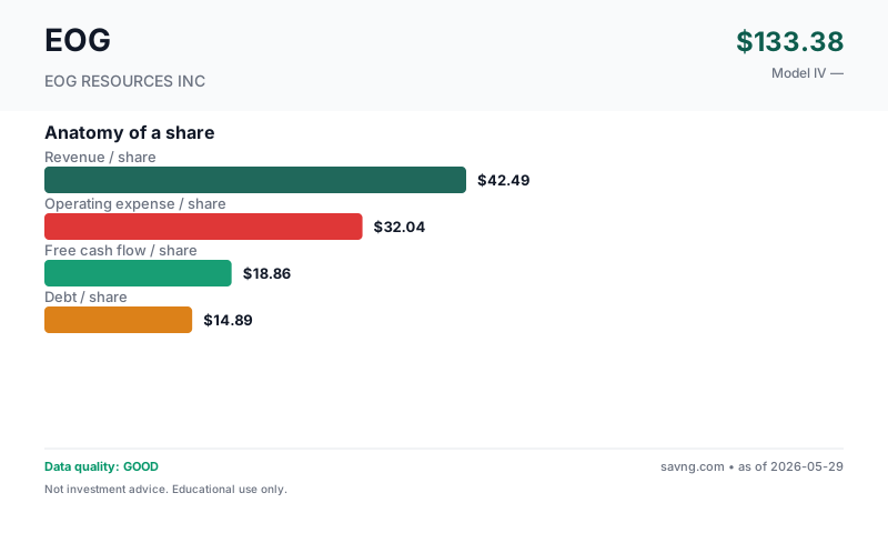
What's free cash flow / what do these mean?
Revenue per share — how much the business earns from customers, divided by the number of shares outstanding. Top of the income statement.
Earnings per share — profit left after operating costs, interest, and taxes, per share. Two versions appear on this page and are not interchangeable: GAAP diluted EPS uses the company's weighted-average diluted share count during the reporting period (this is the "earnings" in "price-to-earnings"); net income per current share divides annual net income by today's share count. They differ whenever the share count has changed.
Owner-earnings free cash flow per share — the cash the business produces for shareholders. Savng's owner-earnings FCF subtracts capital expenditures and stock-based compensation from operating cash flow (SBC is a real dilution cost even though it's non-cash). This is deliberately more conservative than "standard" FCF, which subtracts only capital expenditures — so our figure is lower than the headline FCF you'll see elsewhere. FCF funds dividends, buybacks, debt repayment, and acquisitions; a company can report positive earnings yet negative FCF.
Debt per share — total interest-bearing borrowings divided by shares. High debt-per-share next to thin FCF-per-share is a fragility signal.
What you actually need to decide
Every stock price is a disagreement. Here's the single thing that must go right for the bulls, the single thing that breaks the thesis, and the concrete signposts to watch so you can update your view as real results arrive.
Why it matters: A company can show big profits on paper while burning through cash. FCF is what actually fills the bank account.
Reference: Healthy mature businesses convert 8–15% of revenue into FCF · Growth companies often negative
Full explanation →, currently at $8.70B, continues to decline, or that the rising long-term debt, which has increased to $7.9 billion, becomes a more significant burden than the market currently implies.
- Trends in crude oil and natural gas prices
- Changes in long-term debt levels
- Quarterly operating cash flow performance
The trend, in plain numbers (FY2024 → FY2025, latest reported)
Straight from the financial statements — no model, no opinion. For a small or unprofitable company, the direction of these numbers usually tells you more than any single valuation.
- Revenue fell -4% to $22.63B.
- Free cash flow fell to $9.35B.
- Net income fell -22% to $4.98B.
Nothing was clearly improving year-over-year.
Management & Leadership
Ezra Y Yacob serves as the Chairman & CEO, leading EOG Resources Inc. Ann D. Janssen is the EVP & Chief Financial Officer. Other key executives include Jeffrey R. Leitzell as EVP & COO and Michael P Donaldson as EVP & Chief Legal Officer.
Chairman & CEO
EVP & Chief Financial Officer
What They Make
EOG Resources Inc. is an independent oil and natural gas company primarily engaged in the exploration, development, production, and marketing of crude oil, natural gas, and natural gas liquids. Their paying counterparties are typically refiners, pipelines, and utility companies.
End Markets
Revenue Drivers
Why Is It Priced Like This?
Why Customers Pay
The market prices EOG Resources Inc. at a 37.3% discount to our model's intrinsic valueIntrinsic Value — Our DCF model's estimate of what each share is mathematically worth based on projected cash flows.
Why it matters: Compare to current price. Below IV = potentially undervalued. Above IV = priced for growth that must actually happen.
Reference: Model-derived; quality depends on data and assumptions.
Full explanation →. Separately, the reverse DCFReverse DCF — Instead of asking "what is this stock worth?", asks "what growth rate is the current market price already assuming?"
Why it matters: It crystallizes the bull thesis as a single number you can argue with. If the market expects 40% growth for 10 years and you do not believe that, the stock is overvalued.
Reference: 10–15% = sustainable for strong companies · 20–25% = exceptional · 30%+ = historically very rare
Full explanation → implies the price is consistent with roughly a -4.8% annual per-share cash-flow decline. This discount likely reflects concerns over the company's rising long-term debt, which has increased from $5.0 billion to $7.9 billion, despite positive operating cash flow and revenue growth.
Three Scenarios, Weighted
| Scenario | IV | Upside from today's price | Weight |
|---|---|---|---|
| Conservative | $203.58 | 37.4% | 40% |
| Base | $240.34 | 62.2% | 35% |
| Optimistic | $283.42 | 91.3% | 25% |
| Weighted | $236.41 | 59.6% | 100% |
Reading the last column: it is the move from today's price to each value (IV ÷ price − 1). The headline "premium/discount to model IV" measures the same gap from the value's side (price ÷ IV − 1), so the two percentages differ in size and sign by construction — e.g. a price 8% above value is a value 7.4% below price.
What has to be true
Today's price implies flat-to-slightly-declining cash flow (implied growth ≈ -4.8%/yr) — so historical growth anchors don't apply here. The real question isn't "can it grow like Apple did" but "is the decline the market is pricing in real, or an overreaction?" The Financial Health trend and the Reverse-DCF above are the right lenses for that.
Business Model & Valuation
How They Make Money
Normalized FCF High
Cyclical/commodity sector (Oil & Gas Extraction): normalized FCF uses 5-year median to smooth peak/trough distortions.
Show advanced inputs
| Revenue Growth | 5.0% |
| Eps Growth | 3.4% |
| Historical Fcf Growth | 2.6% |
| Sector Default | 4.0% |
| Sector Default Source | Energy sector default |
| Best Estimate | 4.3% |
| Method | blend(30% revenue_cagr, 70% sector) |
| Growth Basis | total |
What this model does NOT do: this is a consolidated owner-earnings FCF model. Standalone segment assumptions: none. It does not project production volumes, realized commodity prices and unit cash costs independently; their combined effect is embedded in the historical revenue and cash-flow trend the model extrapolates. The calculator above can only approximate a segment's impact through the single consolidated growth rate — it cannot model any one line separately. For a true segment-level view, build a separate model from the company's segment disclosures.
Maturity & Competitive Position
Revenue has been growing at 5% per year over the last four years, from $18.64B to $22.6 billion, and net income has been positive for the last five years.
Geography & Markets
EOG Resources Inc. is primarily focused on operations within the United States, though exact geographic segment splits are not available in current filings.
Geographic Risks
Market Signals
These are timing signals, not value signals — they describe the stock's recent price behavior, not what the business is worth. Use them for the "the thesis looks good, but is now the moment?" question. Each tile below explains what it's saying.
Why it matters: Short-term contrarian indicator. Extreme readings often precede mean reversion, though not always.
Reference: 30–70 normal · >70 overbought · <30 oversold
Full explanation → (14)46.5NeutralMomentum is balanced — neither overbought nor oversold.
Why it matters: When the fast line crosses above the slow line, short-term momentum is turning up; below, turning down. A timing cue, not a value signal.
Reference: Line above signal = bullish momentum · below = bearish
Full explanation →BearishLine below signalThe fast trend is below the slow trend — short-term momentum is currently downward.
Technicals describe price, not the business. A great company can have a "bearish" tape (a buying chance) and a weak one a "bullish" tape (a trap). Pair these with the valuation and health sections above.
QUALITY
Data Quality & Risk Flags (3 notes — click to expand/collapse)
Guardrail Notes (2)
- Cyclical sector: using normalized cash flow (median OCF minus estimated maintenance capex).
- Median OCF: $11.09B, est. maintenance capex: $2.22B, normalized SBC: $177.00M, normalized owner-earnings FCF: $8.70B.
FINANCIALS
Financial Statements (5-year tables — click to expand)
From EOG Resources Inc's SEC filings (EDGAR).
Income (5yr)
| Year | Revenue | Net Income | EPS |
|---|---|---|---|
| 2025 | 22.6B | 5.0B | $9.12 |
| 2024 | 23.7B | 6.4B | $11.25 |
| 2023 | 24.2B | 7.6B | $13.00 |
| 2022 | 25.7B | 7.8B | $13.22 |
| 2021 | 18.6B | 4.7B | $7.99 |
Cash Flow (5yr)
| Year | Operating CF | CapEx | − SBC | Free Cash Flow |
|---|---|---|---|---|
| 2025 | 10.0B | 479.0M | 216.0M | 9.3B |
| 2024 | 12.1B | 1.0B | 199.0M | 10.9B |
| 2023 | 11.3B | 800.0M | 177.0M | 10.4B |
| 2022 | 11.1B | 381.0M | 133.0M | 10.6B |
| 2021 | 8.8B | 212.0M | 152.0M | 8.4B |
How we define FCF: operating cash flow − capital expenditure − stock-based compensation (owner-earnings basis — SBC is a real cost to shareholders even though it's non-cash). Latest year: 10.0B − 479.0M − 216.0M (stock-based comp) = 9.3B. This is the same owner-earnings FCF definition the valuation model uses, though the DCF's starting value is a mid-cycle estimate (median operating cash flow less estimated maintenance capex and stock compensation — by design NOT the table's FCF, which deducts every year's full capex), not this single year.
Balance Sheet
| Total Assets | 51.8B |
| Total Liabilities | 22.0B |
| Equity | 29.8B |
| Total Debt | 7.9B |
Similar companies worth a look
Same sector and industry, similar fundamentals shape. Verify everything yourself — this list is computed mechanically and does not reflect our judgment about whether any of these are a good investment.
The questions people ask about EOG
Is EOG Resources Inc (EOG) a good stock to buy?
EOG Resources Inc (EOG) trades about 37% below our $236.41 estimate of what the business is worth, so the price is not the obstacle. The questions are why it is cheap: check the failure-warning checks, the debt, and whether insiders are buying, all on this page. This is educational research from SEC filings, not investment advice.
Is EOG Resources Inc (EOG) overvalued?
No, by our measure. EOG Resources Inc (EOG) trades at $148.16, about 37% below our estimate of $236.41 for what the business is worth. This is educational research from SEC filings, not investment advice.
What is EOG's intrinsic value?
Our model estimates EOG is worth about $236.41 per share, built from the cash the business is expected to generate, taken from its SEC filings. The market price is $148.16.
What growth is priced into EOG?
Working backwards from today's price, the market is counting on roughly -2.9% a year growth in EOG's cash flow over the next decade. Compare that with the company's actual record on this page.
Where do these numbers come from?
From EOG Resources Inc's own SEC filings (10-K and 10-Q), Form 4 insider filings and daily market prices. Every figure on the page links to how it was calculated, and the model's weak spots are listed next to its results.