
Better Home & Finance Holding Co (BETR) Stock Analysis
Better Home & Finance Holding Co
▾ What's in the 58/100 risk score? (higher = riskier)
Contributions (weight × component score) sum to the total. This near-term score now includes fundamental health (leverage, FCF trend). It excludes the Altman Z score, whose retained-earnings input this filer does not report separately. See the Financial Health section for the full balance-sheet read.
How to read BETR (bank / insurer)
Banks and insurers are valued on what they earn on their capital, not on free cash flow — a normal DCF misleads here.
-
1
Bank / Insurance lens (P/TBV + ROE) ↓
Price-to-tangible-book versus return-on-equity is how analysts actually judge a bank cheap or rich.
-
2
Financial-health screens ↓
Watch the trend in profitability and asset quality, not the (not-applicable) bankruptcy score.
Standard DCF doesn't fit BETR well — but that's expected for this kind of business. The Bank / Insurance Valuation Lens below uses the metrics actually used by analysts who value mortgage lending. Reverse DCF + Football Field also work as cross-checks.
⚠ We found only 1 genuine same-industry (Mortgage Lending) comparable — fewer than the 4 we require for a reliable median. The 8 names in the table below therefore include 7 broader Financial Services names marked fallback, whose business models and margins differ — which is why any median below is computed over that wider set, not over true comparables. So we do not derive a peer-implied share value here. Read the multiples as rough context only.
How does BETR stack up against its closest peers?
Ideally we compare BETR only to same-industry peers, but too few exist in our universe right now, so the basket below mixes in broader-sector names. Treat the multiples as rough context, not a valuation. For a leveraged business, EV/EBIT and FCF yield (both in the table) are usually more reliable than EV/Sales, because revenue multiples ignore differences in margins and debt.
▾ What's "EV / Sales" in plain English?
EV (Enterprise Value) = market cap + total debt − cash. It's "what you'd pay to buy the entire company outright" — you pay the market cap to shareholders and take over their debt, but you keep their cash. EV is fairer than market cap alone because it includes the debt the new owner inherits.
EV / Sales = EV ÷ annual revenue. So "2.5×" means investors pay $2.50 of enterprise value per $1 of yearly sales. Higher = market is paying more per dollar of sales (usually because they expect future growth or fat margins).
p25 / median / p75 are the 25th, 50th (middle), and 75th percentile of the peers' multiples. Half the peers fall between p25 and p75. The median (p50) is the typical peer — that's the benchmark we compare to.
| EV / SalesEV / Sales — For every $1 of yearly revenue, this is how many dollars investors pay to own the whole business (including debt). Why it matters: Works for pre-profit growth companies where P/E and FCF don't apply. The most apples-to-apples cross-company multiple because it ignores accounting choices. Reference: 1–3x for mature companies · 4–10x for software/SaaS · 10–20x for hypergrowth · >20x is rare and demanding Full explanation → |
1.5x / 5.0x / 17.1x |
Bold middle number = median peer. Half the peers trade above it, half below. Computed over 8 peers (broad — see caveat); implausible multiples excluded.
⚠️ Important caveat: peer multiples only work if the peers are genuinely comparable. Always check the peer list below — if the auto-picker grabbed micro-caps or unrelated businesses, the comparison is noise. A medical-device giant priced against tiny biotech startups won't produce a useful signal.
▾ View peer list (8)
| Ticker | Company | Industry | Mcap | EV/EBIT | FCF Yield |
|---|---|---|---|---|---|
| ONIT | ONITY GROUP INC. | Mortgage Lending | $291M | — | 1.6% |
| WEAT | Teucrium Commodity Trust | Investment Banking ·fallback | $182M | — | — |
| XRPZ | Franklin XRP Trust | Investment Banking ·fallback | $230M | — | — |
| WENC | West Enclave Merger Corp. | SPACs ·fallback | $160M | — | — |
| WHG | WESTWOOD HOLDINGS GROUP INC | Asset Management ·fallback | $147M | 29.5x | 9.4% |
| WNEB | Western New England Bancorp, Inc. | Banks ·fallback | $273M | — | 5.5% |
| XFLH | XFLH Capital Corp | SPACs ·fallback | $138M | — | — |
| WTF | Waton Financial Ltd | Security & Commodity Broke ·fallback | $127M | — | 0.8% |
How to value a bank (not a DCF question)
A bank's economic engine is the shareholder equity on its balance sheet — what the accountants say is left over after all loans, deposits, and liabilities are netted out. The bank earns a percentage on that equity each year (its ROE). So the two questions are: (1) what are you paying per dollar of equity (Price / Book)? and (2) how much is that equity actually earning (ROE)? Free cash flow doesn't work here — banks lend out their cash for a living.
Why it matters: For banks and insurers, book value is the regulatory capital they earn returns on. P/B is the cleanest comparison: 1.0× means buying the bank at the same price the accountants say it's worth.
Reference: 0.8–1.2× = fair for average bank · 1.5–2.0× = solid franchise · >2.5× = premium · <0.8× = potentially cheap or distress
Full explanation →
Premium to book — market expects above-average returns on this equity.
Why it matters: For a bank, ROE is the engine. A bank earning 15% on equity will compound book value at ~15%/year if it retains earnings. Combined with P/B, ROE tells you whether a premium price is supported by returns.
Reference: <8% = weak · 10–12% = solid · 15%+ = excellent · >20% sustained = exceptional franchise
Full explanation →
Why it matters: For banks especially, ROA isolates underwriting and operating efficiency from leverage. Two banks with identical ROE may have very different ROAs — one earning it cleanly, one earning it on borrowed money.
Reference: <0.8% = weak · 1.0–1.2% = solid · >1.5% = excellent (very rare for big banks)
Full explanation →
ROA differs from ROE because banks borrow ~10× their equity. Big asset base, smaller equity sliver.
Note: this lens skips Altman Z-Score and Piotroski F-Score (validated on industrial companies, not banks). For deeper bank-specific health analysis: check the 10-K's Tier 1 capital ratio, Non-Performing Loan ratio, and CET1 — these are what regulators actually monitor.
Quality & solvency checks
Cheap stocks can be cheap for a reason. These screens warn when a low valuation comes paired with structural fragility.
Why it matters: Cheap-looking stocks (low P/E or P/B) often have low Z-scores because the market knows the company is dying. Z-score warns you before you fall into a value trap.
Reference: > 3.0 = safe zone · 1.81–3.0 = grey zone · < 1.81 = distress zone
Full explanation →
Altman Z was calibrated on industrial firms and doesn't apply to banks or insurers — their balance sheets are dominated by loans/securities, not working capital. See the Bank Valuation Lens above for P/B, ROE and ROA — the metrics regulators and analysts actually use to assess bank solvency.
Why it matters: High score = fundamentals improving. Low score = deteriorating. Especially powerful for filtering cheap stocks: cheap + high F-score historically outperforms; cheap + low F-score is often a value trap.
Reference: 7–9 = strong · 4–6 = mediocre · 0–3 = weak
Full explanation →
Piotroski F was built for non-financial firms (gross margin, asset turnover, current ratio all assume an industrial cost structure). For banks, the equivalent quality signals are efficiency ratio, net interest margin, and provision coverage — see the Bank Valuation Lens above.
Plain English: the company holds about $100M in cash and is burning roughly $167M/year in operations. At that pace, the cash lasts 7 mo before it must raise capital (diluting shareholders), take on debt, or cut spending.
Assumes constant burn and ignores financing/asset sales. For pre-profit biotech and growth companies, this matters more than a DCF — a great drug pipeline is worthless if they run out of money before approval.
What if you assume different inputs?
Here's where we land — and what happens if you change the assumptions. Drag the sliders to set your own Discount RateDiscount Rate — The annual return you demand for taking single-stock risk instead of buying a safe Treasury or index fund.
Why it matters: Higher discount rate = stricter valuation (a stock has to produce more cash to be worth holding). Lower = more generous.
Reference: 8–12% is standard · 9–10% matches S&P 500 historical return · Below 7% is illogical for single-stock risk
Full explanation → (the annual return you demand for single-stock risk) and terminal growth; the value updates live so you can see whether the stock looks cheaper or richer. The discount rate starts at 10.0%, the figure our model used for BETR. Open Advanced to also change beta, growth and the rate path.
Note: no headline intrinsic value is published for this stock (the valuation is held for a data-quality reason — see the notes above). The calculator below is a what-if tool: the values it produces are your assumptions played out, not our estimate.
A full intrinsic value isn't shown for BETR because the valuation is currently held for a data-quality reason (see the guardrail notes above). The reverse-DCF reading still works — it needs only the price and cash flow — but we won't publish a forward value until the underlying data passes our checks.
—
⚙ Advanced — tinker with every input (beta, growth, rate path, margin → full intrinsic value)
Analysis narrative not yet available for this stock.
As of 3 months ago
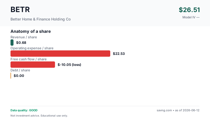
Anatomy of a share
What you're buying per share. Bars are at the same scale so you can see the relative size of revenue, costs, cash flow, and debt — not just read them in a table.
What's free cash flow / what do these mean?
Revenue per share — how much the business earns from customers, divided by the number of shares outstanding. Top of the income statement.
Earnings per share — profit left after operating costs, interest, and taxes, per share. Two versions appear on this page and are not interchangeable: GAAP diluted EPS uses the company's weighted-average diluted share count during the reporting period (this is the "earnings" in "price-to-earnings"); net income per current share divides annual net income by today's share count. They differ whenever the share count has changed.
Owner-earnings free cash flow per share — the cash the business produces for shareholders. Savng's owner-earnings FCF subtracts capital expenditures and stock-based compensation from operating cash flow (SBC is a real dilution cost even though it's non-cash). This is deliberately more conservative than "standard" FCF, which subtracts only capital expenditures — so our figure is lower than the headline FCF you'll see elsewhere. FCF funds dividends, buybacks, debt repayment, and acquisitions; a company can report positive earnings yet negative FCF.
Debt per share — total interest-bearing borrowings divided by shares. High debt-per-share next to thin FCF-per-share is a fragility signal.
The trend, in plain numbers (FY2024 → FY2025, latest reported)
Straight from the financial statements — no model, no opinion. For a small or unprofitable company, the direction of these numbers usually tells you more than any single valuation.
- Revenue grew +52% to $164.9M.
- Free cash flow is negative at -$188.2M — the cash burn narrowed vs last year.
- Still unprofitable at -$165.9M — loss narrowing.
Nothing was clearly worsening year-over-year.
Management & Leadership
What They Make
Company description not yet available.
Why Is It Priced Like This?
What we use instead: earnings (P/E, EV/EBIT), book value (P/B) — computed from the figures this company does report, shown in the sections below. Those numbers are unaffected by the missing cash-flow data.
Business Model & Valuation
Growth / Revenue DCF
Negative free cash flow: revenue/margin growth model used - standard FCF DCF is unreliable for companies still scaling.
Show advanced inputs
| Revenue Growth | 15.0% |
What this model does NOT do: this is a consolidated owner-earnings FCF model. Standalone segment assumptions: none. It does not project net interest income and fee-income lines independently; their combined effect is embedded in the historical revenue and cash-flow trend the model extrapolates. The calculator above can only approximate a segment's impact through the single consolidated growth rate — it cannot model any one line separately. For a true segment-level view, build a separate model from the company's segment disclosures.
Maturity & Competitive Position
Geography & Markets
Market Signals
These are timing signals, not value signals — they describe the stock's recent price behavior, not what the business is worth. Use them for the "the thesis looks good, but is now the moment?" question. Each tile below explains what it's saying.
Why it matters: Short-term contrarian indicator. Extreme readings often precede mean reversion, though not always.
Reference: 30–70 normal · >70 overbought · <30 oversold
Full explanation → (14)45.2NeutralMomentum is balanced — neither overbought nor oversold.
Why it matters: When the fast line crosses above the slow line, short-term momentum is turning up; below, turning down. A timing cue, not a value signal.
Reference: Line above signal = bullish momentum · below = bearish
Full explanation →BullishLine above signalThe fast trend is above the slow trend — short-term momentum is currently upward.
Technicals describe price, not the business. A great company can have a "bearish" tape (a buying chance) and a weak one a "bullish" tape (a trap). Pair these with the valuation and health sections above.
QUALITY
Data Quality & Risk Flags (5 notes — click to expand/collapse)
Guardrail Notes (5)
- FCF negative: revenue/margin growth model projects future cash flows from revenue trajectory.
- Price is far above the model output - market may be pricing optionality, narrative catalysts, or margin expansion beyond what trailing cash flows support.
- Illiquidity discount 7% applied (small/micro-cap — harder to exit, demand a margin).
- Extreme valuation (P/IV withheld — see the note above); output dominated by data/units issue (often a multi-class share-count mismatch). Suppressed.
- DATA UNAVAILABLE: per-share values suppressed due to missing/unreliable shares data.
FINANCIALS
Financial Statements (5-year tables — click to expand)
From Better Home & Finance Holding Co's SEC filings (EDGAR).
Income (5yr)
| Year | Revenue | Net Income | EPS |
|---|---|---|---|
| 2025 | 164.9M | -165.9M | $-10.80 |
| 2024 | 108.5M | -206.3M | $-13.65 |
| 2023 | 16.1M | -536.4M | $-58.09 |
| 2022 | 12.3M | -877.1M | $-3.01 |
| 2021 | — | -6.5M | $-0.33 |
Cash Flow (5yr)
| Year | Operating CF | CapEx | − SBC & adj. | Free Cash Flow |
|---|---|---|---|---|
| 2025 | -166.6M | 1.2M | 20.4M | -188.2M |
| 2024 | -380.0M | 3.4M | 26.8M | -410.1M |
| 2023 | -159.7M | 456,000 | 54.2M | -214.3M |
| 2022 | 938.3M | 11.7M | 30.5M | 896.0M |
| 2021 | -3.2M | — | — | -3.2M |
How we define FCF: operating cash flow − capital expenditure − stock-based compensation (owner-earnings basis — SBC is a real cost to shareholders even though it's non-cash). Latest year: -166.6M − 1.2M − 20.4M (SBC & adj.) = -188.2M. This is the same owner-earnings FCF definition the valuation model uses, though the DCF's starting value is a projected from revenue × terminal margin, not this single year.
Balance Sheet
| Total Assets | 1.5B |
| Total Liabilities | 1.5B |
| Equity | 37.2M |